I’ve been trying to come up with stylish ways to add character to our small Manhattan rental while also finding creative ways to store all of our stuff. Our problem isn’t so much that our space is too small to fit all our stuff — it’s that we don’t have enough furniture — or as I like to remind the fiance, the right furniture — to fill out the space and house all of our smaller crap so the apartment ends up looking a little undecorated and empty. It’s a cool layout that could be used as one big open space or divided into a living room and dining room area or even three areas if we wanted to separate the office, and there’s lot’s of fun nooks and crannies. I am pretty sure the biggest issue is that our loveseat, which was a good idea when we lived in a much smaller, narrower apartment, is too small as the main seating option, but it could just be a matter of reworking the layout. I love the comfort of a sectional, but while we save up for an “adult” (read: nice) one that doesn’t scream sectional, I’m getting inspired by these stylish apartments that center around smaller couches like our own classic, nondescript white one.

Modern Classic
I like the layering of rugs — the texture is nice. I also like the setup with the desk near the couch but not crowding it and the mix of classic and modern with the lucite coffee table (great for making small spaces appear bigger), black desk lamp and metallic Parson’s desk paired with a classic couch, desk chair (note: add to my wish list), mirror and floor lamp.

Clean & Airy via Sadie + Stella
Maybe instead of a sectional, all we need is more chairs like a comfy arm chair or one of Pottery Barn’s chair-and-a-half’s and an ottoman? Even strategically placed side chairs (though not very comfy looking can help add seating and fill out the living room area/help section it off from the rest of the apartment).

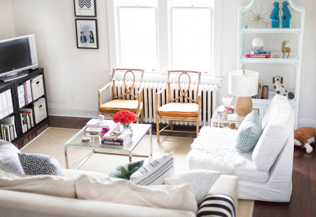
Classic-Glam CeCe Barfield
I love this use of space — there’s a lot squeezed into this beyond chic space (which belongs to the super fab designer and blogger behind the Decophile, a must read), but it doesn’t look crowded. The mix of classic and modern with glam touches is so chic and slightly feminine but because it’s done in grays, black and white, it’s male-friendly and not girly (which, as you probably know by now, I hate). A few things to note are the use of symmetry (the matching mirrored side tables and lamps, the tall book shelves flanking each side of the window, the coordinating pillows on the couch), which is a smart strategy for maintaining a clean, uncluttered feel in small spaces. I also love the play on proportions — you can tell this room belongs to someone who knows what she’s doing (its owner, CeCe Barfield studied at Parson’s and works for the renowned Bunny Williams), because she’s built up into the space with tall vertical bookshelves and tall lamps that almost feel exaggerated in proportion to the tables but work because they help to draw your eye up, making the room appear larger while taking advantage of the higher ceilings to compensate for the smaller square footage. I also love how she chose oversized pillows for the smaller loveseat (which looks just like ours), to make it appear larger and adding style to an otherwise plain couch. The addition of the pillow to the classic grey side chair is also a nice touch. I actually have a similar chair though in a more neutral gold with brown legs, and I love the idea of adding a pillow there. The ghost chair paired with the Parson’s desk is also a great way to add a modern-glam touch without crowding the space. I’ve been debating whether to add window treatments to our living space but I like the idea of roman shades as an alternative to curtains — feels modern and much more open. But the rug is really want gives this room its personality and takes it to the next level. Its not really our style per se, but it definitely brings the glam factor and extra dose of style.