
I’m really digging these bright apartments. Though my place is mostly neutrals and blue (pictures soon I promise), I’m always tempted to go bold and bright when I see interiors as cherry and chic as these. The hang-up that keeps me in solid neutral land: I’m afraid I’ll get sick of the print and/or palette quickly, where as solid neutrals feel more calming and classic. But they’re also safe and maybe even boring. What do you think? Do you like quiet neutrals or bold patterns and hues for your home?
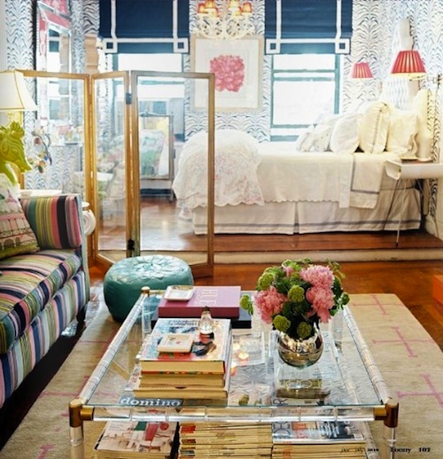
There’s so much about this room I love, but especially the mixing and matching of bright prints going on here.
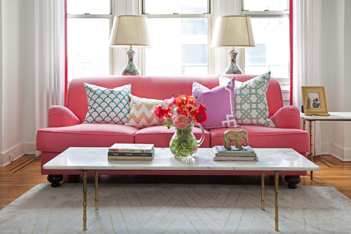
A hot pink couch is a bold move, but it works and doesn’t feel too trendy or girly here.
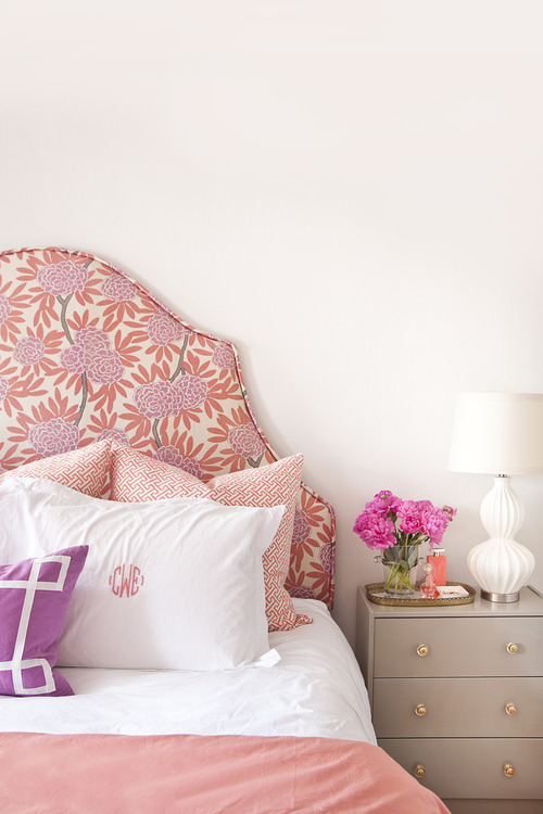
This option is more my speed: Go bold and bright with the bed only and counter it with clean white walls, neutral furnishing. A printed headboard is something I’ve been toying with but finding the right print can be tricky. And then you have to make sure your artwork etc. all fits the bill, and right now, we’ve sort of got to work with what we’ve got until the budget expands.

I don’t feel overwhelmed by the mix of bright colors here, because it’s dispersed onto accents rather than a big canvas, with neutrals to ground the round and avoid giving you a headache.

Uber preppy but yet feels fresh, not dated, when mixed with more sleek and modern furniture. I have to say, I’m a huge fan of bordered duvets and rugs. And while kelly green can feel a little cheese-brain ’60s to me, I am digging it here. Love the paper print too.
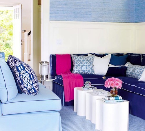
So I’m all about blues, but I rarely think to mix shades — this room though is inspiring me to do just that, especially since navy is my favorite and right now we’re working with a rug with a pattern that’s a slightly lighter blue. The pop of pink is nice in a non-commital way.
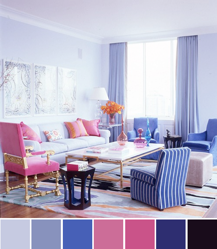
If I saw it on its own, I’d say, no way. But in this room and tied together with a mix of colors, I’m a big fan. Lesson here is that rather than picking two colors, work with a palette, allowing you to play with multiple shades for a dynamic look. Working with different shades of one color is especially key because that way you don’t have to waste time debating if that blue is the exact same one as the blue in your striped throw pillows.

obSESSed! I love how the bright blue makes the zebra print a little less sexy-glam and a little more fun and chic. Limiting it to the hallway is a cool idea for making your space appear bigger and more dynamic and getting a husband/boyfriend on-board with it. Every time I see this paper, I stop and stare. Maybe I should try it…although seems like a waste for a rental. Sigh.

